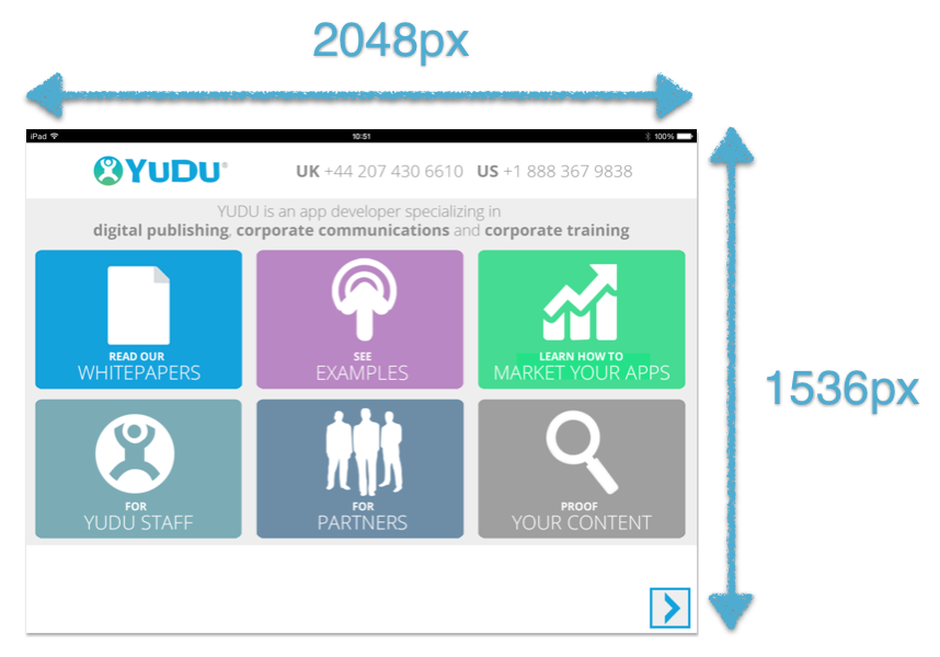
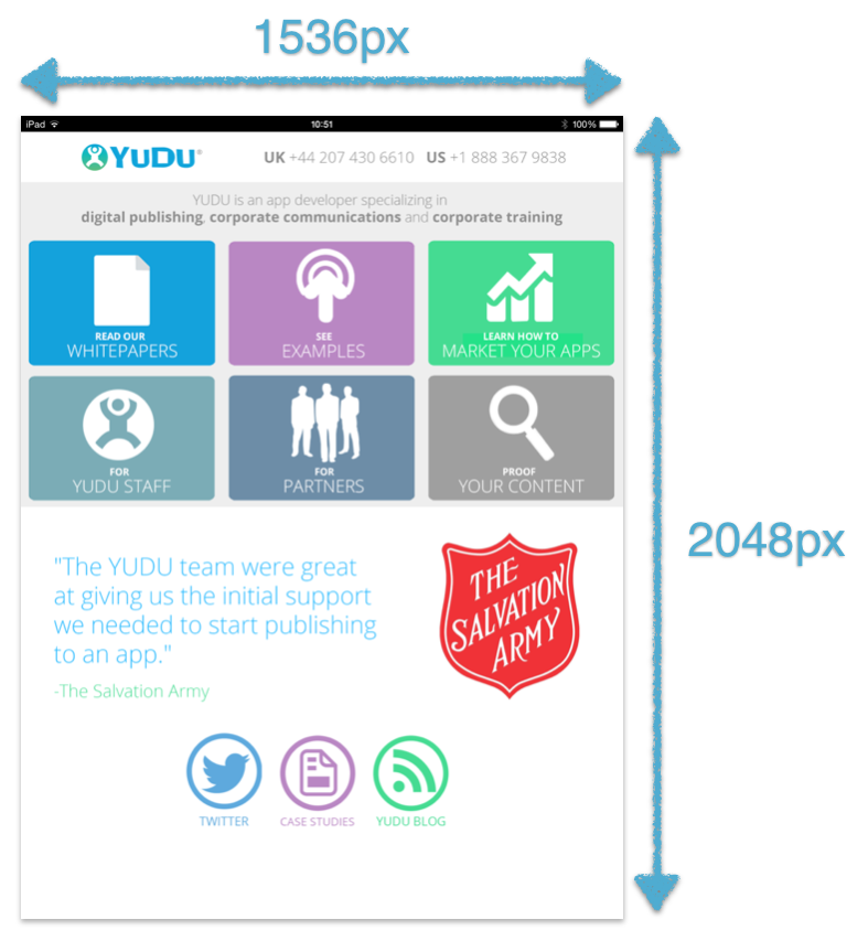
The below details the total screen-sizes, and the actual area you have to work with.
Welcome and Category pages fill 100% of the available width and height of the target devices screen.
One consideration is that toolbars and tab bars are automatically added by the app when it’s compiled, and these will ultimately encroach on your designs, so it’s important to ensure that there’s nothing you wouldn’t want covered up present at the very top or very bottom.
The top toolbar is 40px, so if you want to ensure that say, a logo, isn’t obscured by this toolbar, then give it a margin-top of 40px.
If you are using Adobe Edge, ensure your stage size is always going to be 2048px X 1536px for landscape and vice versa for portrait.
iPad / Landscape

iPad / Portait

